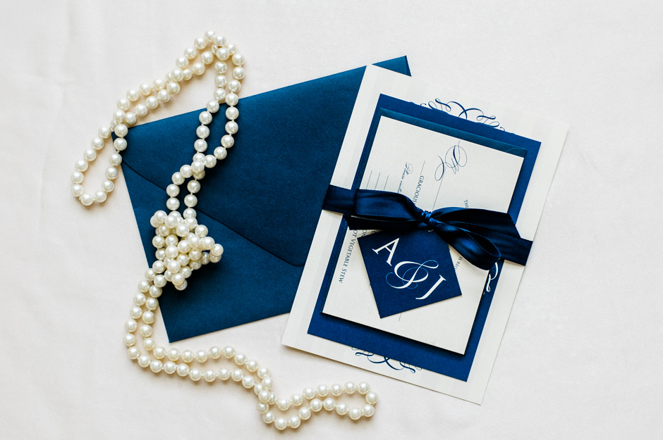
Amy and Justin's Classic Vineyard Wedding Invitations
I know I've said this before, but I absolutely love to watch the evolution of a design when couples first contact me to create their wedding stationery. When Amy first contacted me, she was pretty set on using something similar to this design. Once we saw it, though, with the other details of her event, we decided it may be a bit too rustic for what she was looking for.
So we went back to the drawing board!
And after some back-and-forth edits, we finalized her design. Completely amazing and different from what she first wanted, right? I was so thrilled with how these turned out, y'all.
The lesson: It's easy to fall in love with an idea or design you see on someone's website or Pinterest, but remember to always infuse your own style into what you ultimately use! Just because you love a design doesn't mean it fits the personality of you and your fiancé, so make sure you love your final design!
All photos courtesy of the oh-so-talented Caroline Lima.


